The Salvation army offers its members with many different items to purchases. Because the type of products that they offer were so vastly different we knew the taxonomy was going to be one of the hardest challenges here. Also the user group is a bit older that are not as up to date on current digital eccomerce trends as their younger counter parts.
Visit site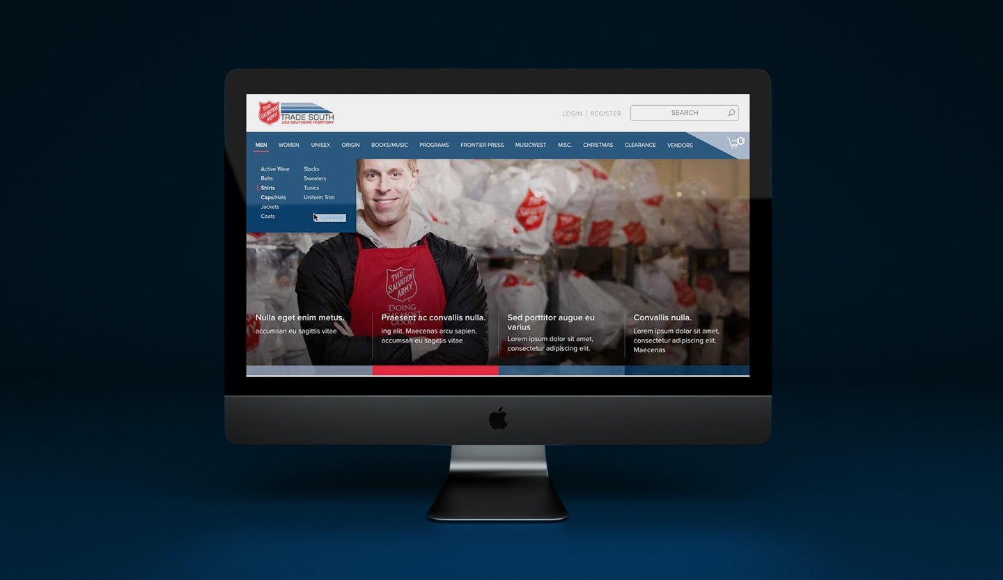
I researched other Salvation Army e-commerce websites to see what the standards were. Most of the user flows we would be reusing and improving upon. From a UI perspective they had a great framework implemented however some lacked a modern aesthetic. In my audit I documented simple improvements on things such as color contrast, spacing, and much more.
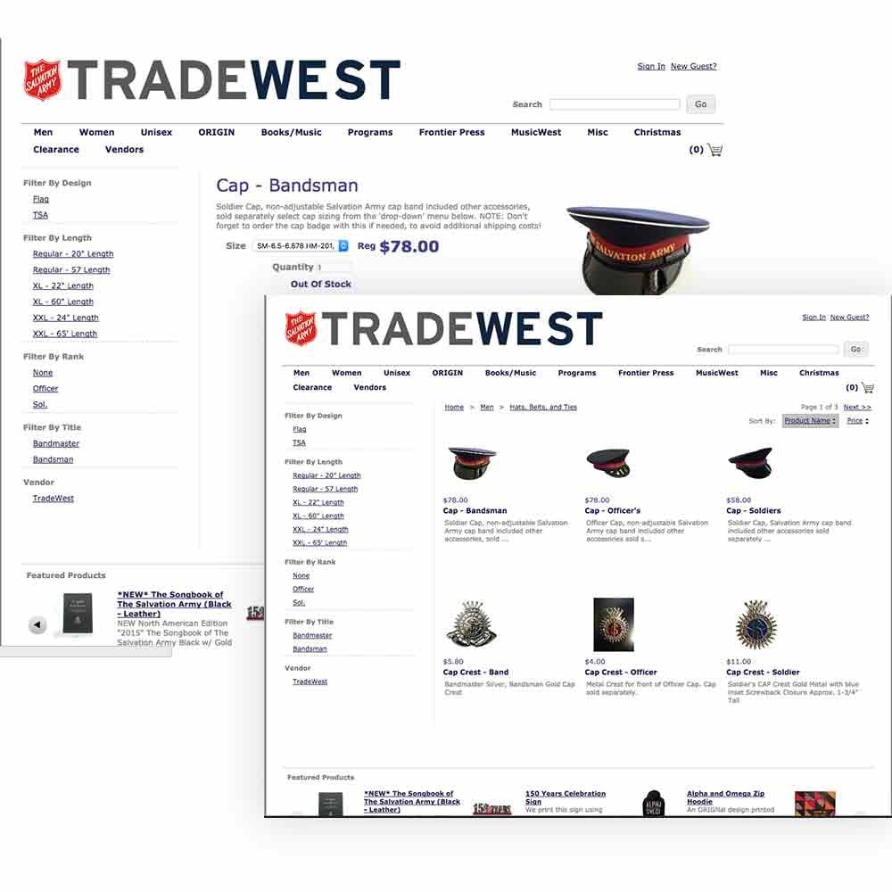
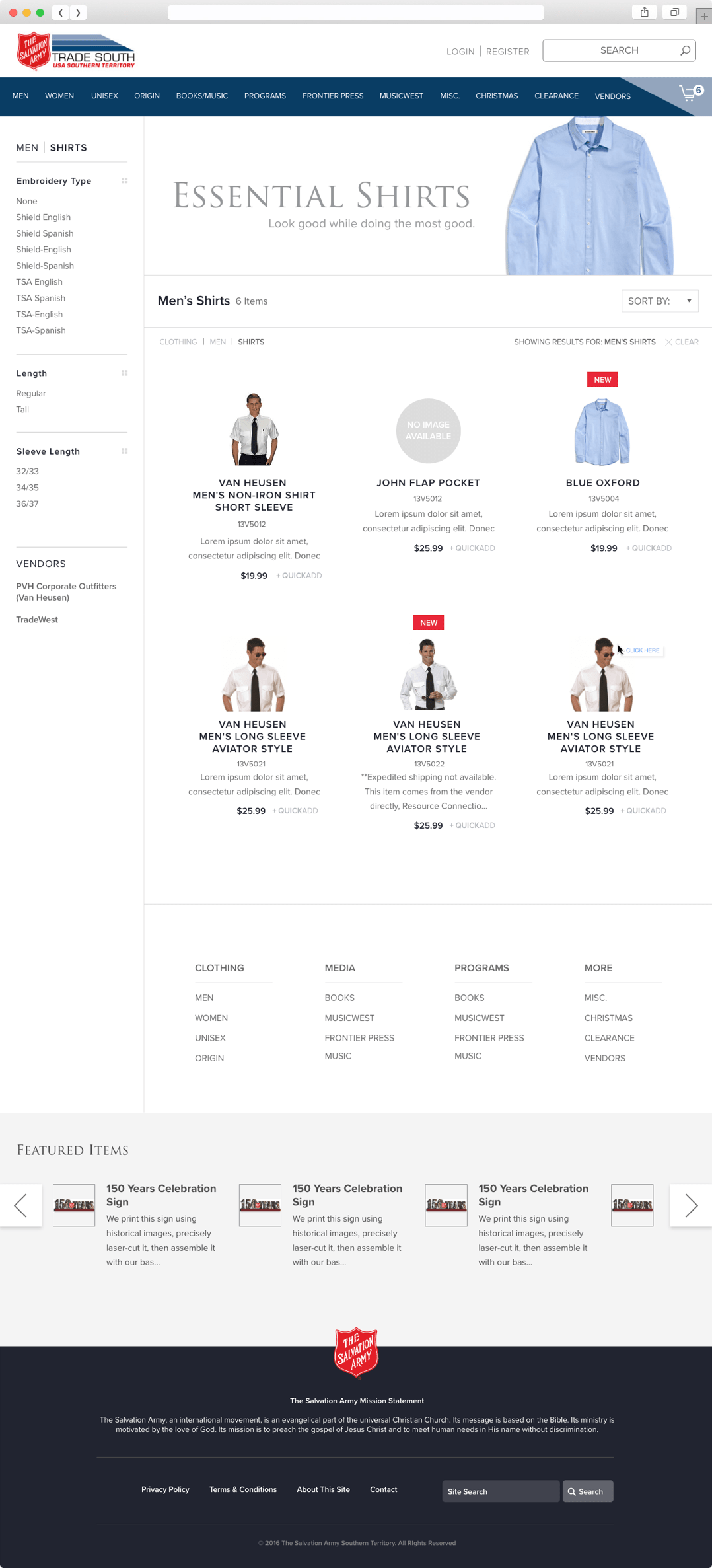
I then looked at the content of the existing Trade West and Trade South sites, which had been built to sell only a couple hundred products with a small number of categories. I also discussed future product and workflow plans with the team, to get a better idea of what the structure of the new site should look like. We were looking to expose several hundred more products and have a system in place to easily upload several new products as they came in without the taxonmy getting out of hand.
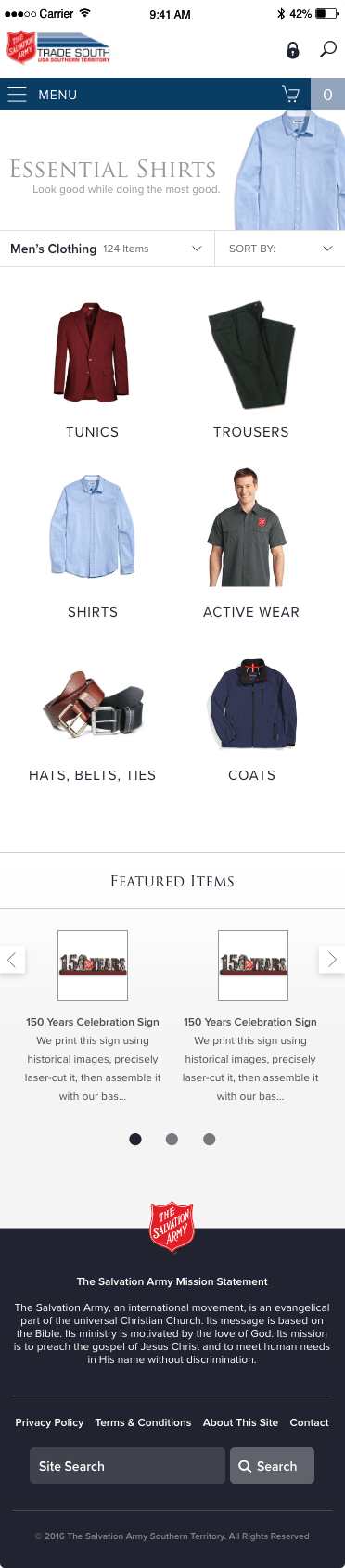
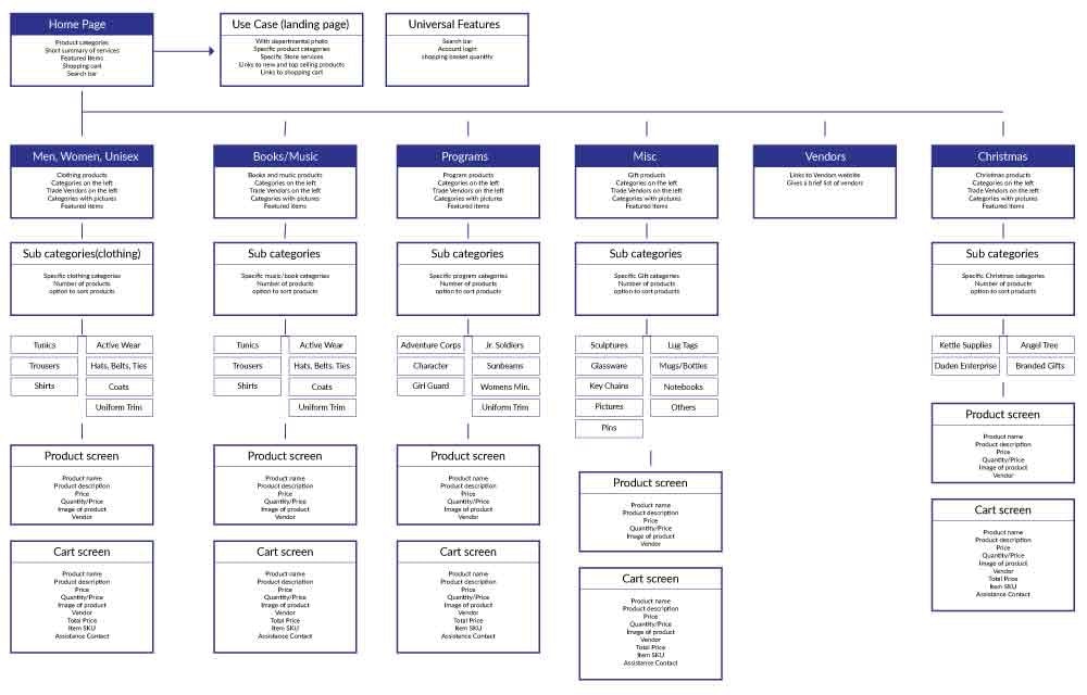
After analyzing how the site was structured, I developed a new site structure. It’s very similar to the current system, except it organizes pages by much broader sub-categories. Certain items fell into several categories. Instead of making them so specific the items will now fall where ever they classify.
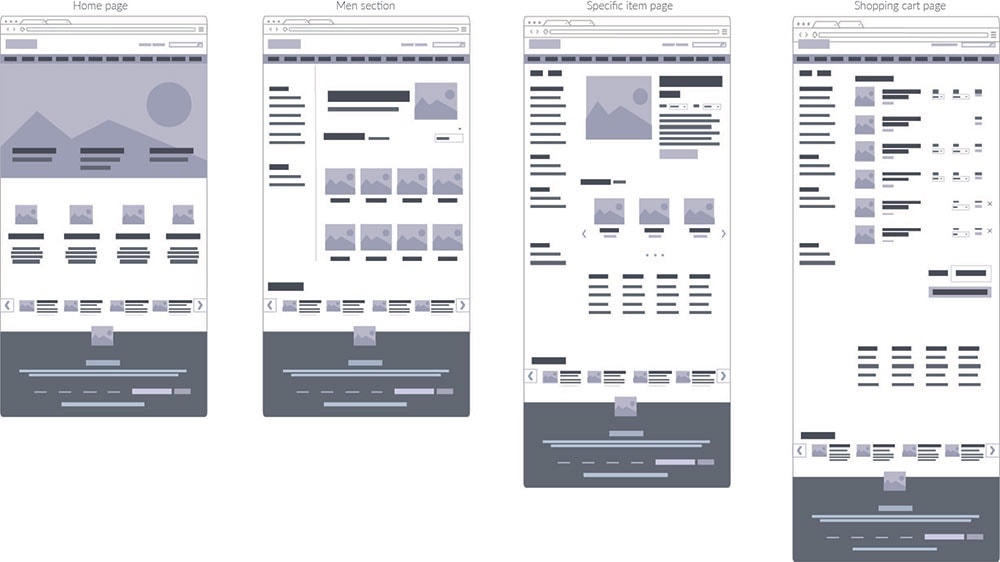
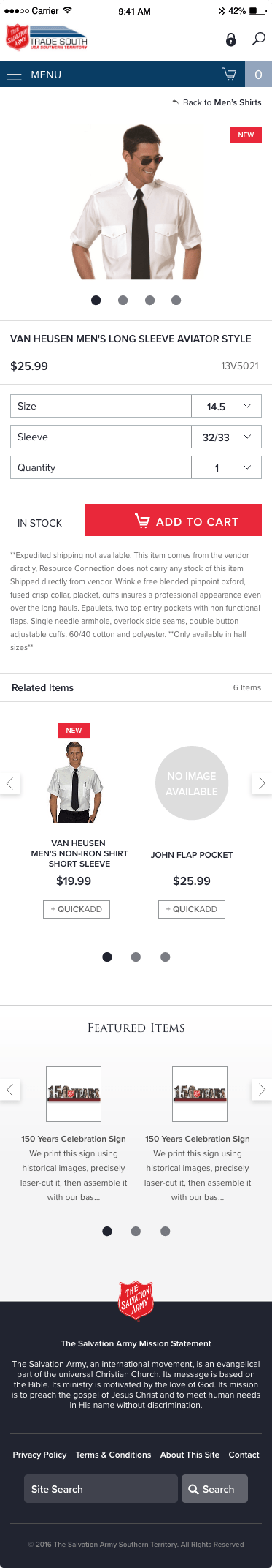
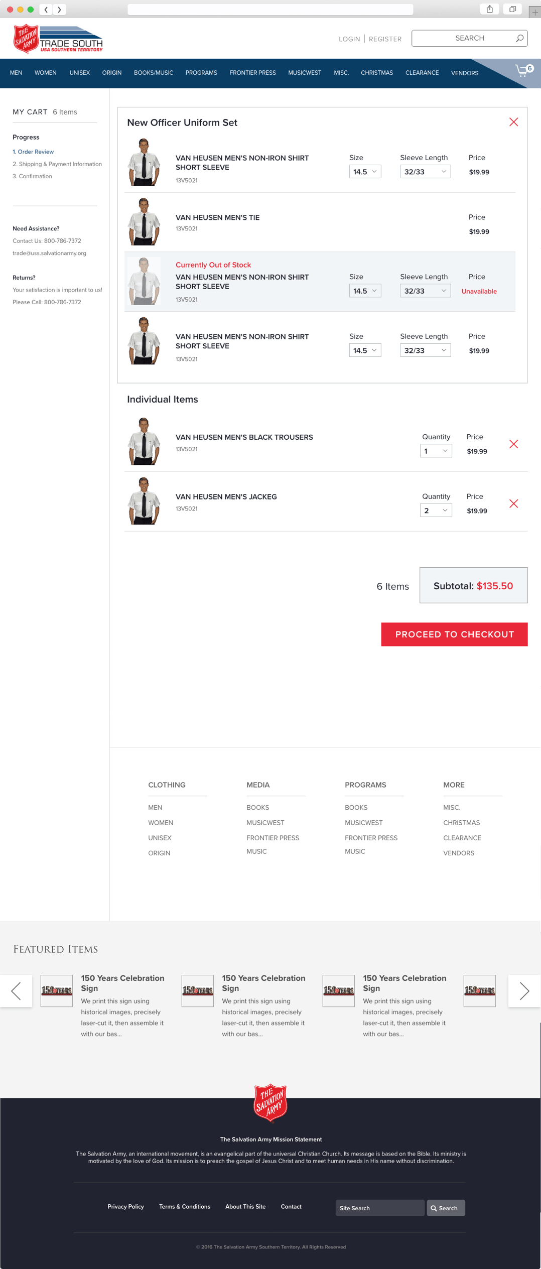
I then went into the wireframing process. I ended with medium fidelity wireframes. The last site had a solid concept and I was able to draw inspiration from it when thinking of the visual layout of the new site.