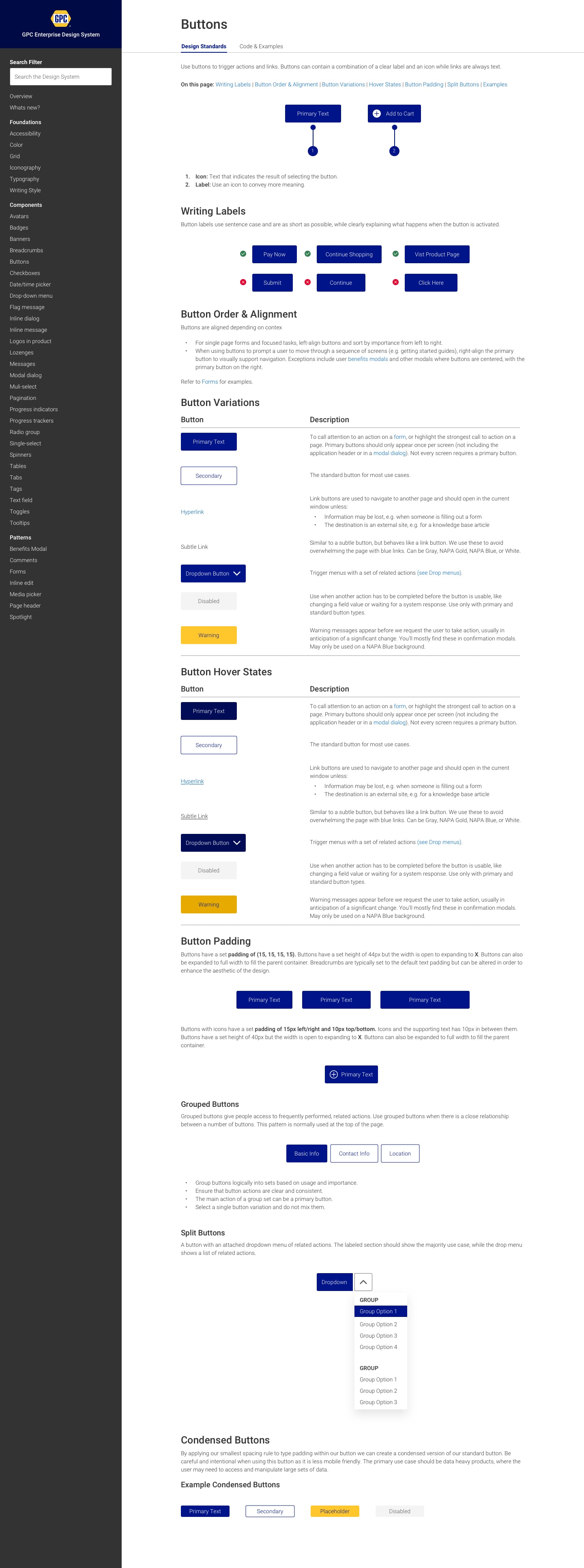
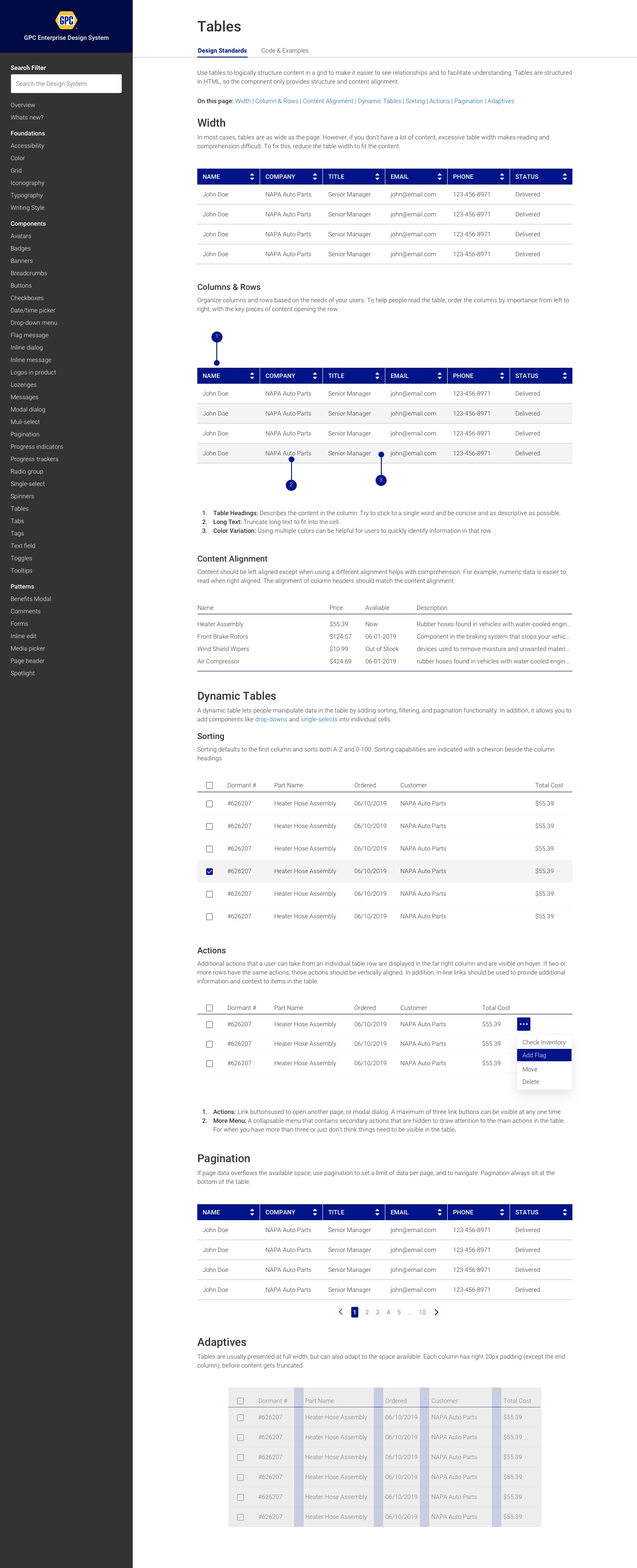
A design system is the combination of visual language, tools, technology, and people— and people are the most important part. As I document our process, describe my roles, and show the visuals, I should call out that the biggest challenges we faced in the project were culture change, trust, and commitment to design and build the system. As this project unfolded, we developed a shared language about how we build products that helped our product and engineering organization is ways I never would have expected.
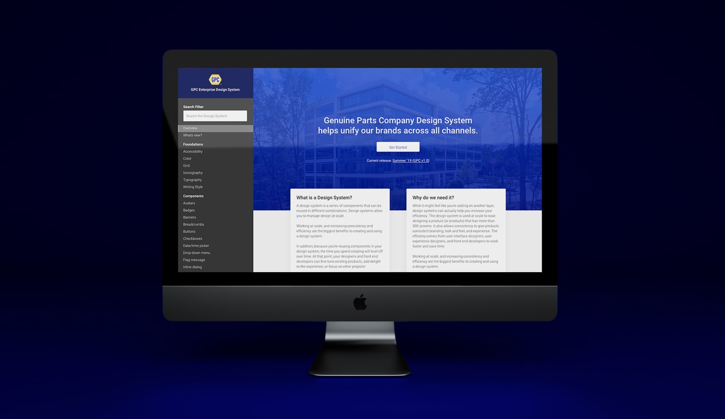
Our team goals for the project was a design language and reusable components that would increase our design and development velocity, incorporate a many learnings from customer research into the product, and reduce our time spent reinventing the wheel on solutions. We aligned these goals with our company goals for Q1 & Q2:
Unify our productsStrategic Planning, Budgeting, Citizens Engagement, and Operational Performance
Fast BenefitsProvide near-term benefits to product and engineering roadmap
Paths to SuccessImprove information architecture, wayfinding, and usability.
Ease, Clarity, ConsistencyReduce product complexity and provide more clarity.
Here, roughly speaking, are the project stages we went through to create the design language:
ProspectExecutive Proposal and Finding Help
DiscoverAudit, Research, Product Goals
ExploreInspiration and Design Language Directions
Define & DesignDesigning Components
Document & DesignGuidelines and Code
I pitched, planned, and managed the design creation of The GPC Design System, and worked with a team of designers, developers, project managers to envision and design the system. I took advantage of my own super powers of reading and taking in a bunch of information to understand how other companies approach solve the problem and how we can make it happen as a small team. I referred Brad Frost and a number of other leaders in Design System to learn and find the right methodologies. We used his Atom approach as a way to finding mutual understanding between developers and designers.
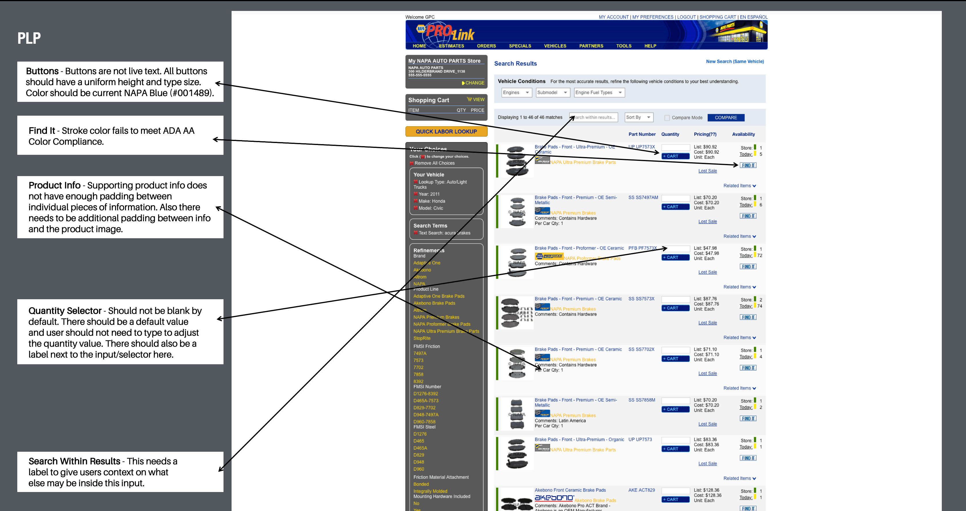
One of the first orders of business were to perform a visual audit of GPC's NAPA Auto Parts platforms. Cohesion across all brand touch points builds trust with consumers and improves the customer experience. So we got obsessed with our brand visuals and started planning how to make them work for us in better, more effective, ways. A Visual Audit is a wonderful way to see how far you’ve come and make a solid plan for future projects.
Based on our company mission and understanding of customer needs, the design team worked with company leadership to create experience design principles. The principles are the foundation of what our customers feel when they use our products and how we make it happen. As a UX team, they help us make tough decisions and measure success.
DataWe knew that one of the biggest issues we had with our current platforms was how we displayed large sets of data to users. We researched a lot of different approaches and rules to data design that we wanted to build our design system around.
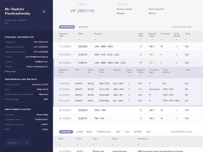
After exploring different directions we could go we worked on key elements of our language. The OpenGov brand colors, design principles, navigation, and product work together as a visual language with a voice and personality we honed in sketch, workshops, and mockups. We made high-impact choices on font and color.
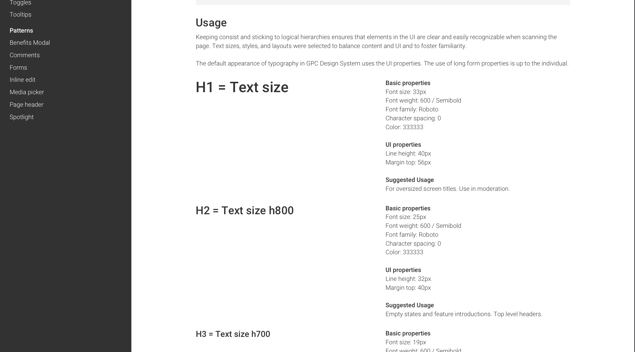
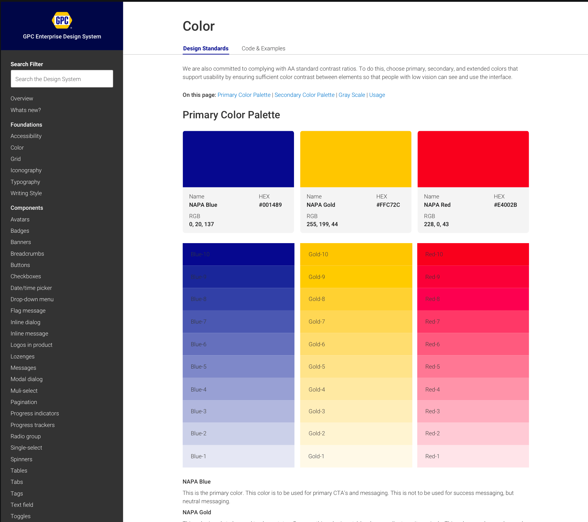
Once we had a fluent design language we design modular UI components that worked a holistic system. This was a collaborative, laborious, and often fun part of the process.
