As one of Genuine Part Company’s subsidiaries, NAPA is a main actor in the auto parts aftermarket. Functioning on many channels, NAPAOnline.com is their e-commerce site for their retail customers, allowing the users to search and find parts for their vehicle. Customers are able to earn rewards points through the NAPA Rewards program every time they shop at a NAPA store.
The initiative was to integrate the NAPA Rewards program into NAPAOnline.com in order to unify the two platforms and to now allow for NAPAOnline customers to use and earn Rewards points online, in addition to earning at the brick and mortar stores.
Keeping the objective in mind, we began by analyzing all touchpoints on NAPAOnline.com that would be affected by the integration of NAPA Rewards into the site.
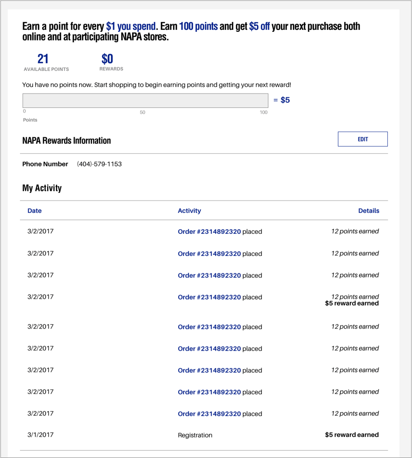
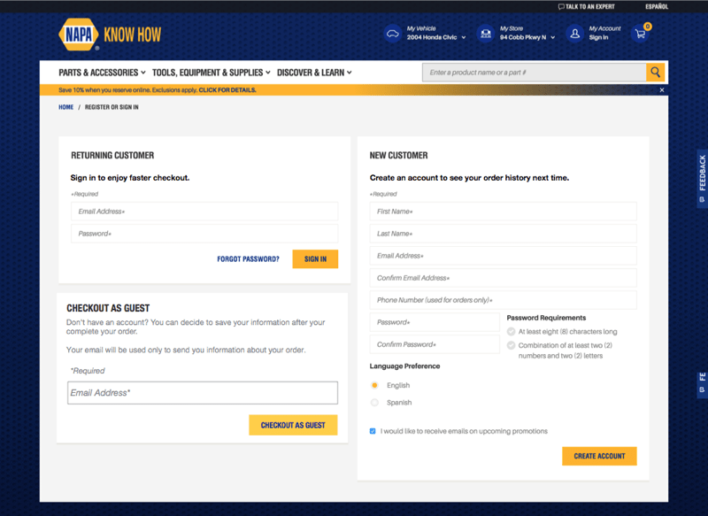
At the time, NAPA Rewards was its own site and users were prompted to access the site and create an account through receipts they got from shopping at a NAPA store. Users could see their history on when they earned their rewards points based on their purchase history and when they reached 100 points for their $5 reward. In addition, a new enhancement that was being introduced through the integration was the ability to earn points and redeem rewards by shopping online.
Thus, we identified 3 key functionalities in the user flow to carry over onto NAPAOnline.com:
1. Creation of an account: Users would need the ability to add an existing or new Rewards membership when signing up for a new NAPAOnline.com account.
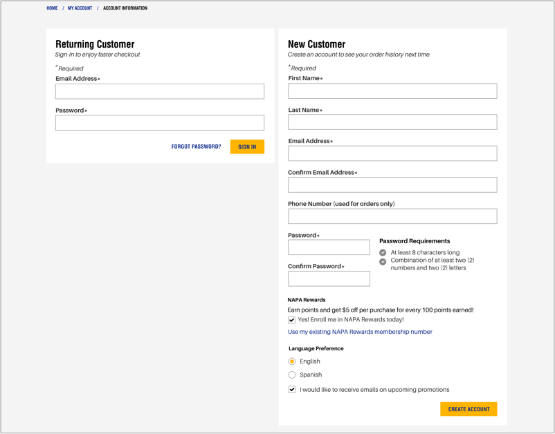
2. Account Management: Existing NAPAOnline.com users would need the ability to add an existing or new Rewards membership to their account. Users with an active prds membership would also need the ability to view their purchase history and how much points they earned from a purchase, how much points they currently have accumulated, and how much points they have left til their next reward.
3. Path-to-Purchase Journey: Because the Rewards membership would be new and unknown to many online NAPAOnline.com shoppers, there would need to be a clear way for the users to sign up for a Rewards membership during the path-to-purchase flow since they may not have an account created. Therefore, this resulted in targeting the checkout process of the site, and incorporating a seamless way to sign up fAnalysiss membership without exiting checkout.
Once we analyzed what would be affected and how, we focused on the checkout flow and enhancing it to support the sign up for a Rewards membership.
I conducted a competitive analysis of direct and indirect competitors in the retail space. I focused on the checkout flow, and how any reward programs and sign-ups were accessed and utilized during the purchase flow. My research revealed that the current NAPAOnline.com’s checkout was outdated and not following current best practices for an e-commerce checkout. I identified the pain points and where there was opportunity to improve the interactions and flow.
It became clear to me that simply adding a quick sign-up for a Rewards membership would not fit with the current NAPAOnline.com checkout flow. Because we wanted to have a seamless and easy way to sign up for rewards during checkout, we decided to completely redesign the checkout on NAPAOnline.com following 2 guidelines.
Default to guest checkout: Prior to integration of the Rewards and NAPAOnline.com, we had added the option to checkout as a guest on NAPAOnline.com. There was an overwhelming usage for this option, with over 50% of users continuing as guests. Furthermore, customers on NAPAOnline.com were frequently new users shopping. This guided our direction towards directly bringing users to the checkout process rather than having them decide how to enter checkout.
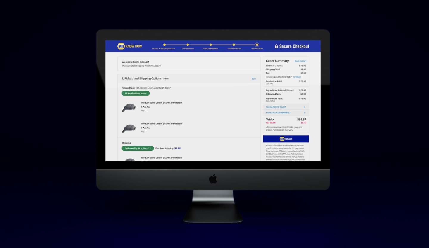
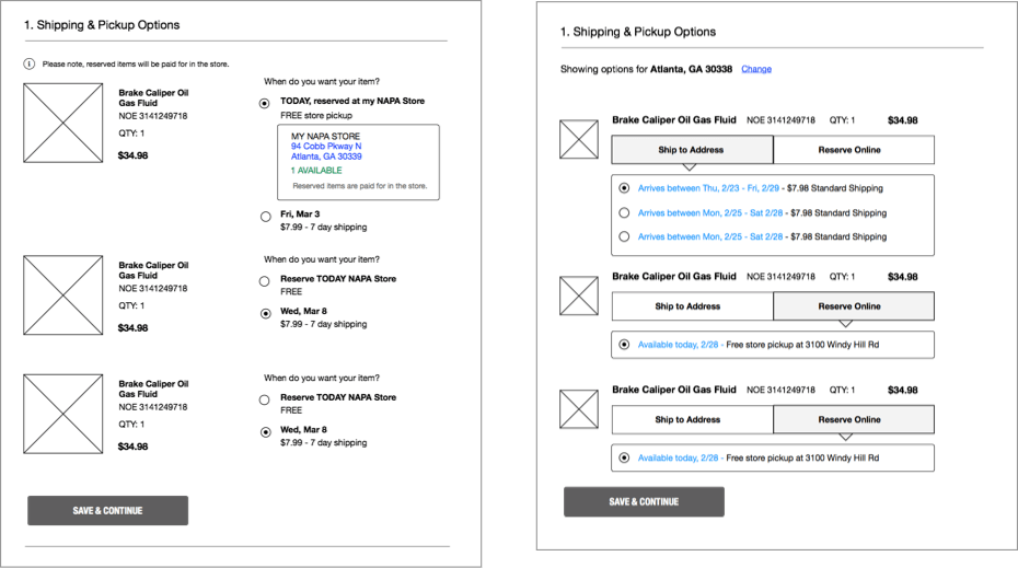
Display order summary and clear order of operations: In this example, the user is buying items to ship to home. Too many form fields were displayed at once and users were not given focus on what to complete in order. Users also couldn’t see their order summary at this step to reconfirm what they are buying.
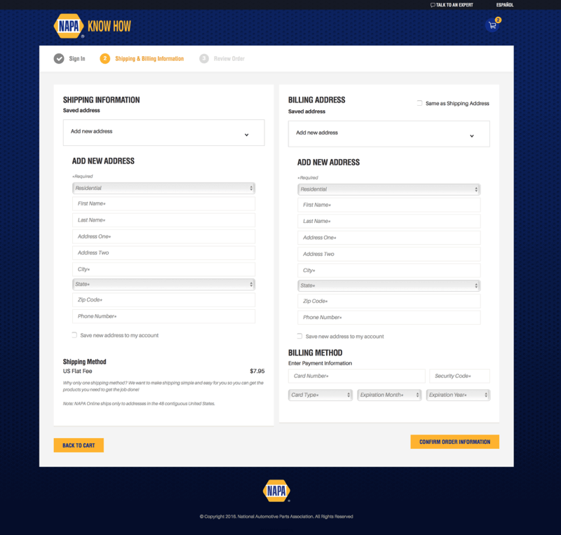
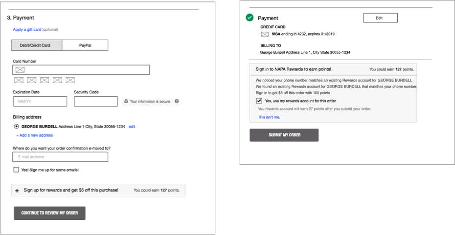
One of the goals with the enhanced checkout was to display only the required fields and eliminate unnecessary actions by the user that could become automated by the system - such as card type detection. It was also important to always have visible the user’s order summary during checkout so that they wouldn’t have to exit checkout to view their order summary.
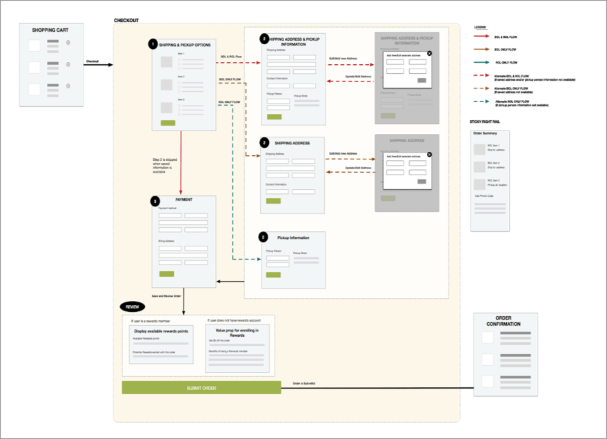
Once the pain points and goals were determined, I began to identify each of the flows that would be needed for the checkout. Users have the ability to reserve items online, then pick them up and pay for them at a store. Users could also buy items online and ship it to an address or they could reserve items AND ship them in a single order. Each flow required pieces of information to complete the order. For the checkout flow, there were 2 types of user states - a guest user, and a returning user. Each user state would determine the steps a user would go through in each flow and what actions they would take.
I worked with the business analyst to capture the necessary fields and information that were needed in each of these flow. I then mapped out the steps and fields the user would need to go through and fill out based on each of these flows and user states. I shared the screenflows with the team to align on the direction of the enhanced checkout and understand what the steps would be.
One of the initial versions of the checkout screenflow. This flow initially showed the steps with delivery and pikcup options available to the user.
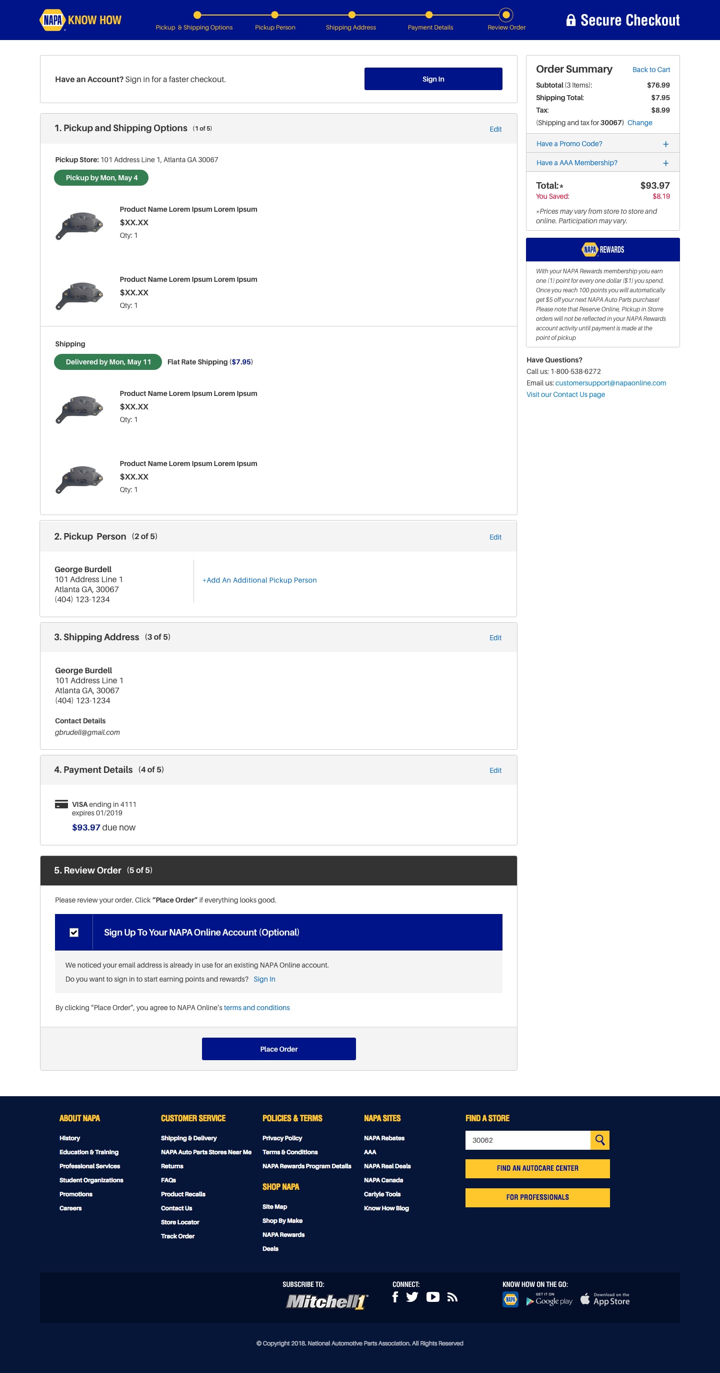
My next step in the process was to begin brainstorming each of the steps in the checkout flow. I produced the wireframes that followed the steps consecutively in the flow. To simplify the checkout process, we went in the direction of a ‘one-page checkout’ where users provided and saved their information one step at a time. This adhered to our guideline of displaying an order summary and clear order of operations so that the users were always aware of their entered details and order information.
During the first few iterations, I met with the business analyst and product owner to ensure requirements were being met and that it would be technically feasible. We discovered some limitations once the steps were visualized that weren’t going to be able to be implimented at this time for checkout such as providing delivery dates or multiple shipping methods, which were features I had originally included in the screenflows.
Understanding these setbacks during my brainstorming process had me take a step back and revisit the screenflow and some of the earlier wireframes.
This was the updated screenflow after reviewing the earlier version with business and development team.
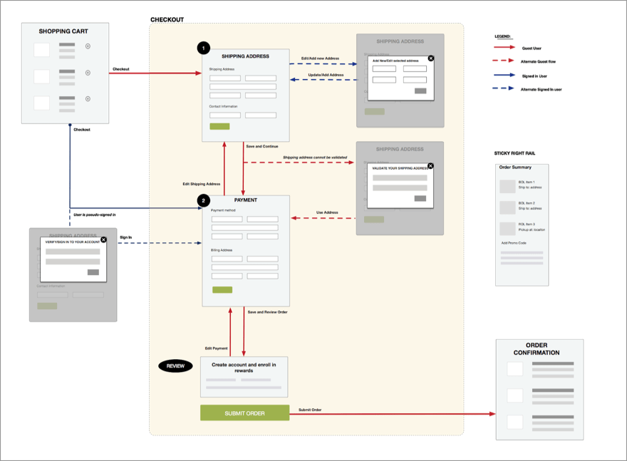
Provide Users delivery expectations: One of the main changes that we were proposing in the enhanced checkout was selecting delivery options for the items in the order. Since items could be either shipped or reserved in a store, we provided these options in the first step so that users would be given their final delivery or pickup dates as early as possible (at this time, users were not given future pickup dates or delivery dates anywhere else). Because of business timelines, these features were not to be implemented at this time.
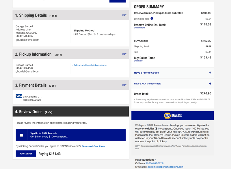
Another large feature that was being introduced in the checkout was enrolling in or signing into NAPA Rewards during checkout. I didn’t want the Rewards signup to be disruptive to the user and the business required it be within checkout. This caused some back and forth between us on when and how to present this option to the user. Based on the initial research and competitive analysis I had done, I called out that it would need to be communicated to the user so they understood we were trying to help them save money (by earning points with their order or signing in to capture points). I presented options on where to present the Rewards signup during the early iterations. We decided to include it during the Review step since creating an account wasn’t relevant to the payment step, and users could take the final moment before placing their order to decide whether they wanted to enroll in Rewards or not.
 Iterate, Iterate, Iterate!
After revisiting the flow, I iterated on the steps in each flow and continued to share the progress with the team to gather feedback. My final deliverables for the project included a complete deck of the flows, wireframes, and states of each component and step with annotations.
NAPA Rewards was successfully fully integrated into NAPAOnline.com with the release of the redesigned checkout. We monitored conversion rates and user behavior post-release to ensure users weren’t experiencing problems through their experience. The checkout has gone through some changes since the original redesign based on what we’re observing from the user behavior.
This was overall a successful release with a positive result. However, there were a lot of lessons learned throughout the process. Initially, the project had called to integrate NAPA Rewards into NAPAOnline.com - not to redesign checkout. Adding in the redesign of the checkout made the project a lot larger than anticipated. Chunking out this project into smaller releases overtime would have allowed us to be more thorough throughout the process. I also learned the value of sharing early with the team - this will help us align on the same vision and overall understand the features and functionality being brought on. A collaborative team was essential to the result of this project.