
Case study · Grainger KeepStock
Building the KeepStock Design System
A design system for warehouse and inventory tools, rebuilt from an e-commerce foundation.
Stock levels
Site 0423 · Main warehouse
| SKU | Item | Bin | On hand | Status | |
|---|---|---|---|---|---|
| 4KE21 | Nitrile gloves, L, 100-pk | A4-12 | 18 | Low stock | |
| 2UB47 | Safety glasses, clear lens | A4-03 | 64 | In stock | |
| 5LE16 | Battery: AA, Premium, Alkaline, 4-pk | A4-07 | 0 | Out of stock | |
| 1VT92 | Hex bolt, 3/8"-16 x 1" | A4-15 | 220 | In transit | |
| 3PN58 | Shop towels, 200-ct | A4-09 | 6 | Damaged |
Context
The wrong system for the job
KeepStock is Grainger's inventory management platform, used at more than 6,000 locations. When we began building a new suite of inventory management applications from the ground up, we inherited a design system that was originally developed for e-commerce.
It had strong visual polish and consumer-facing patterns, but it lacked the flexibility and functionality that warehouse teams, procurement staff, and inventory managers need every day. As Lead UI Designer on KeepStock, I led the effort to build a system that would help the team move faster together.
The new system had to serve 5 product teams at once: 8–10 designers and 30–35 engineers, all shipping in parallel.
Audit & gap identification
Built for browsing a catalog, not managing stock
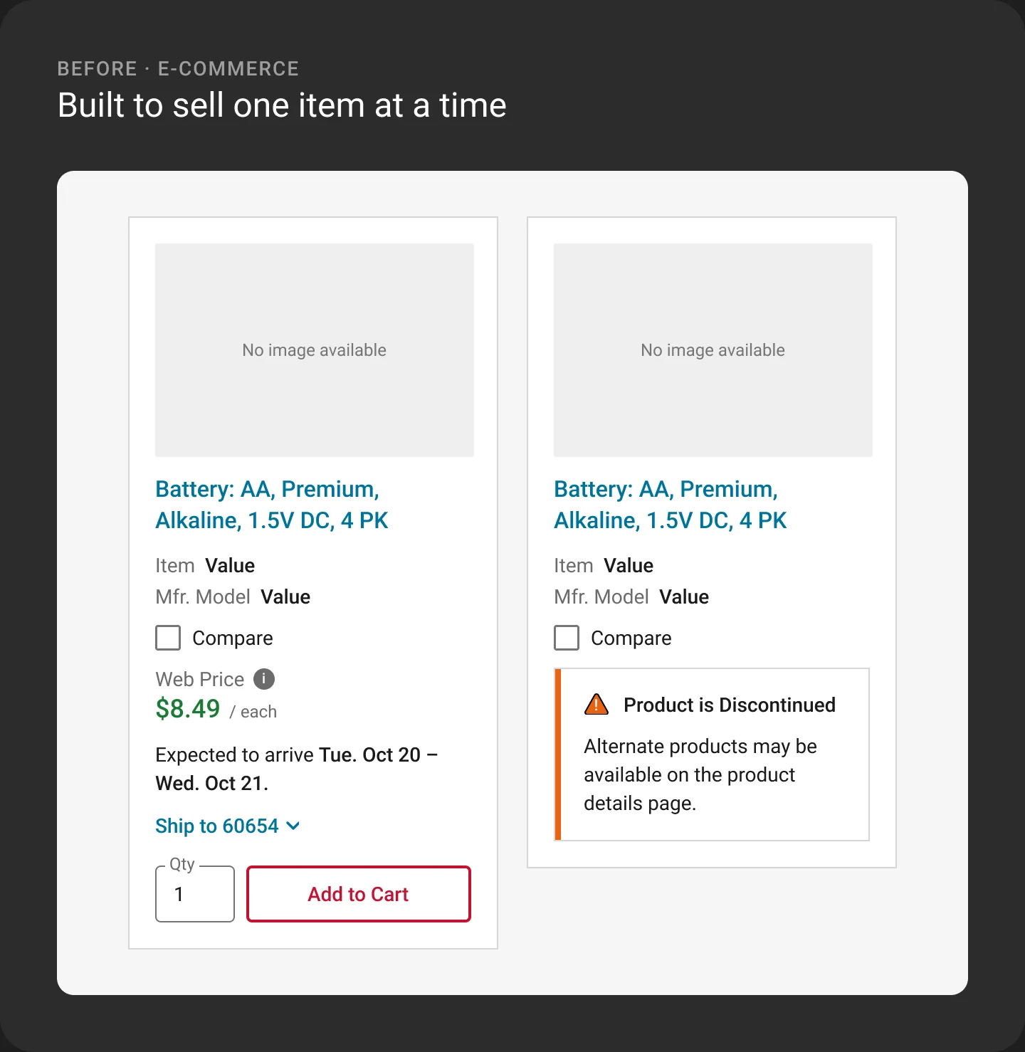
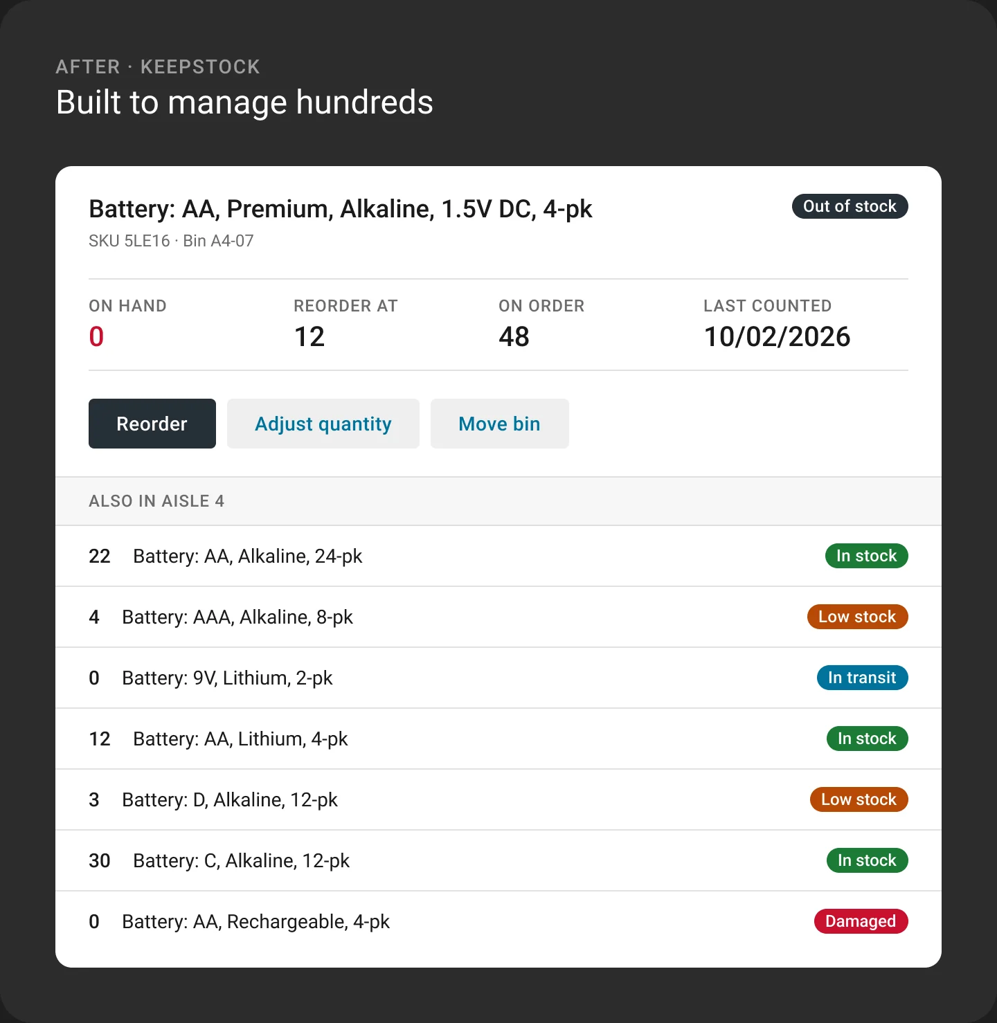
I audited the e-commerce system to see what could be reused and where it fell short. The same product tells the story. On a product card, it's something to buy. In a stockroom, it's something to count, find, and replenish.
Data presentation
Catalog-style tables couldn't sort, filter, or edit inline, and key actions like stock adjustments were buried.
Forms
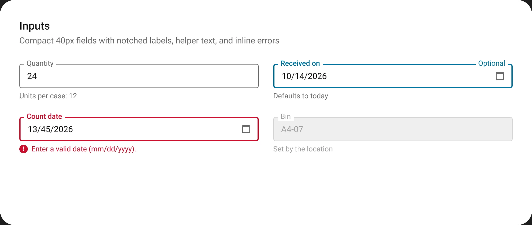
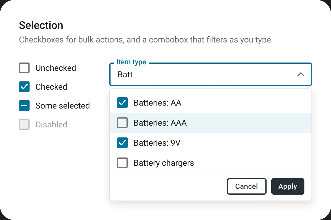
Checkout-style forms had generous spacing, no field grouping or auto-suggest, and slow validation feedback.
Operational states
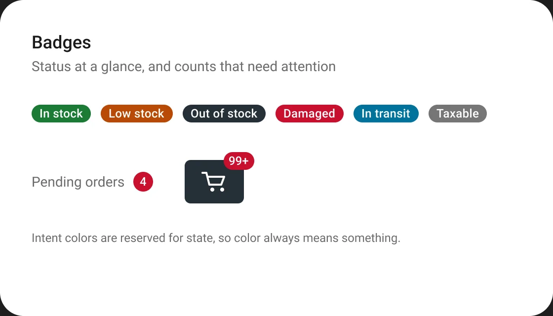
There were no badges or variants for states like damaged, out of stock, or pending shipment.
The warehouse floor
Bright retail colors weren't built for readability under the varied lighting of a warehouse floor.
Approach
Audit, listen, prioritize
Map every gap
A comparison matrix mapped each existing component and pattern against real inventory use cases.
Hear from the floor
Warehouse staff, procurement teams, and IT specialists showed where the inherited system got in their way.
Reuse what works
Buttons, icons, and some layouts only needed small changes. Everything else was rebuilt.
Fix the biggest pain first
Issues were ranked by user impact, starting with tables, forms, and data visualization.
Foundations
Hierarchy without extra size
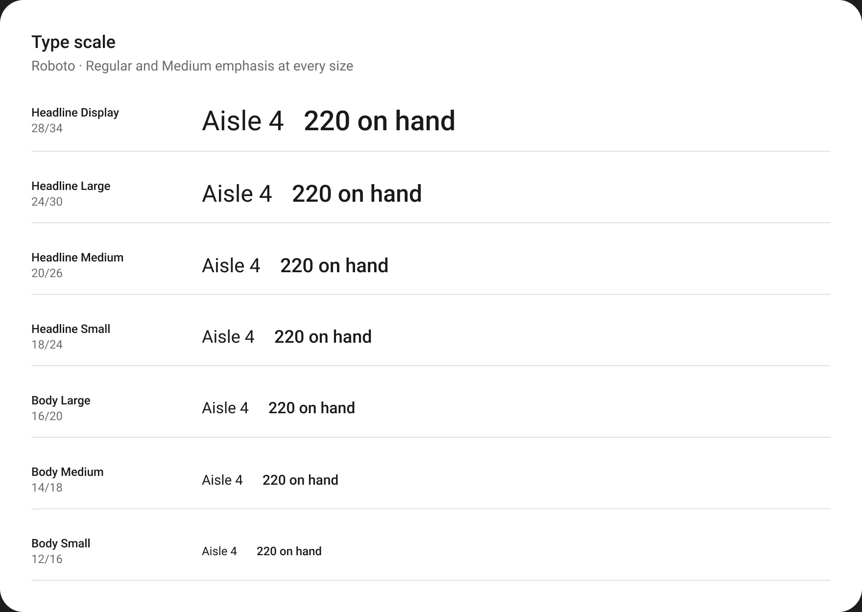
Dense screens can't rely on big type to show what matters. The type scale pairs a Regular and a Medium emphasis style at every size, so teams can create hierarchy inside a table row without changing its height.
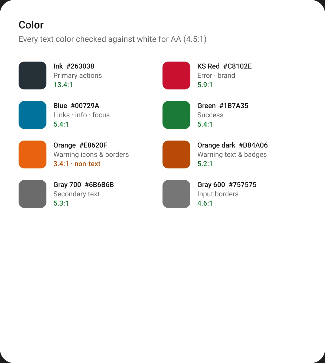
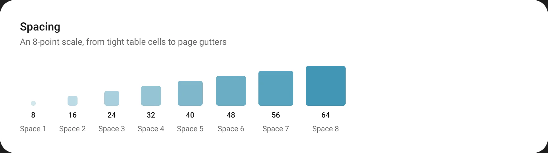
Color, spacing, and iconography guidelines were written to meet WCAG AA, so readability holds up in tight layouts.
Components
120+ components, built for the work
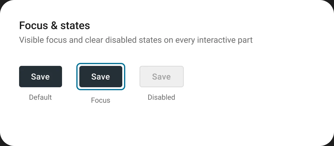
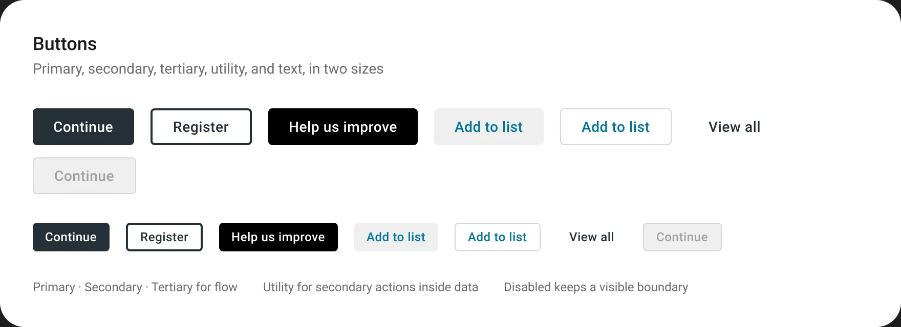
I designed more than 120 custom components in Figma, all in active use, from buttons and data tables to modals and barcode and QR scan UIs. Each one has variants for every state, including the disabled, error, and empty states that operational tools hit constantly.
Every component ships with design and developer documentation, and key components add usage examples with do's and don'ts.

Usage guidance
Documenting the decisions, not just the parts
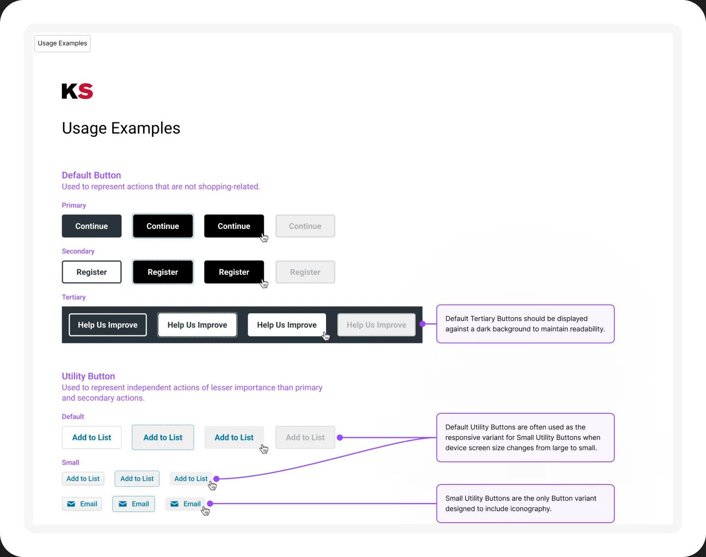
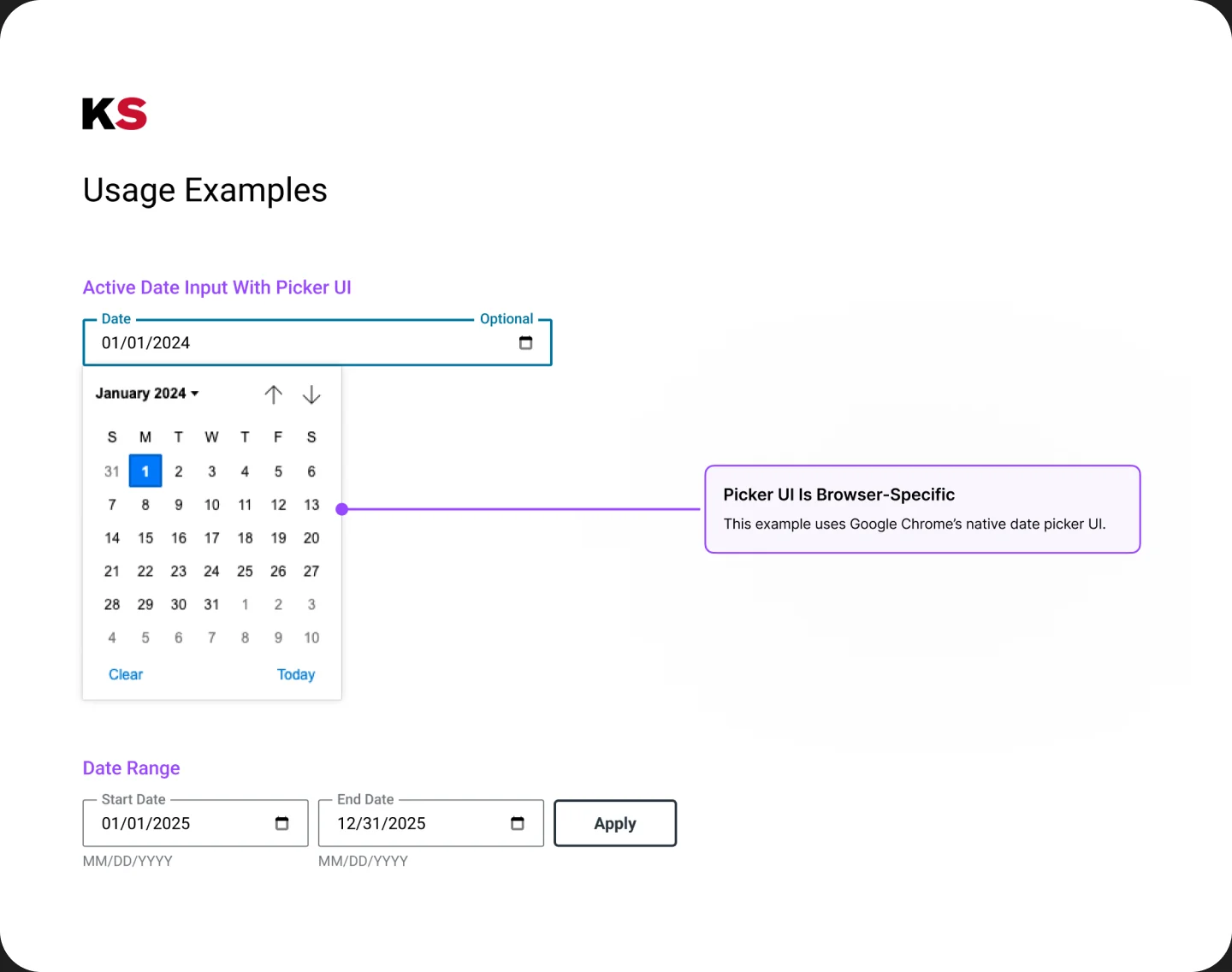
Usage pages annotate the calls teams actually have to make: when a utility button replaces a primary one, how small utility buttons respond as screens shrink, why tertiary buttons sit on dark backgrounds, and when a date picker defers to the browser's native UI.
Governance & adoption
A system people build together
A system only helps if teams use it the same way. I established a governance process that created more opportunities for designers to work together and gave everyone early visibility into how the system was emerging across the product.
That visibility grew when we hired a dedicated front-end engineer and started pulling the visual system into code.
Outcomes
Next case study
Storage Unit Builder