
Case study · AutoZone
AZ Checkout Experience
A four-step checkout wizard, rebuilt as one native screen in the AutoZone app.
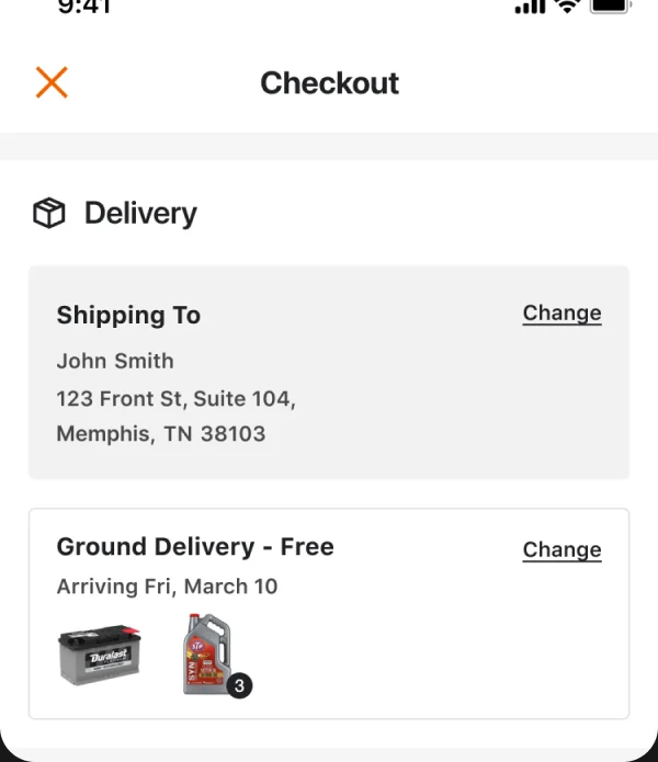
01 Delivery
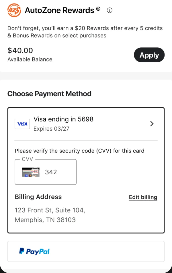
02 Rewards & payment
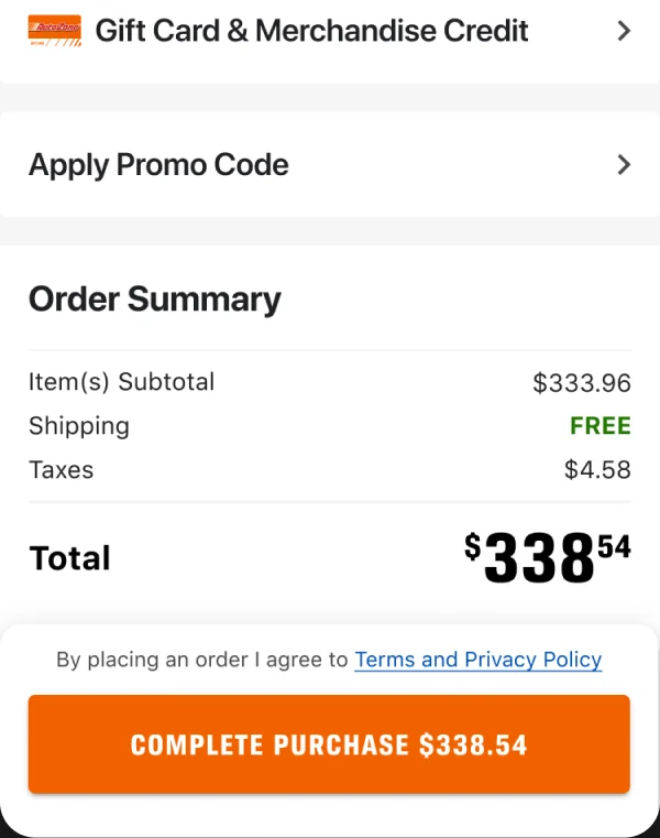
03 Review & purchase
Context
A new app deserved a new checkout
The AutoZone app started as a wrapper around the mobile website. When the company rebuilt it natively in SwiftUI, checkout was where the rebuild mattered most.
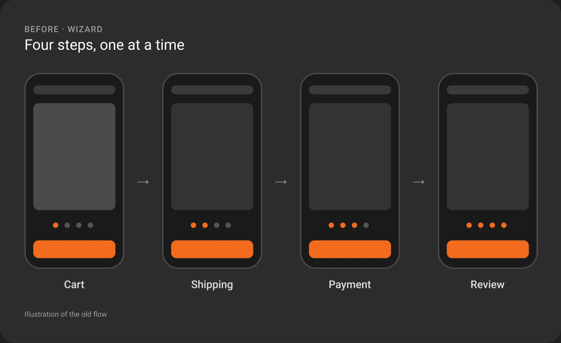
The old checkout was a four-step wizard, with cart, shipping, payment, and review on separate screens. Customers couldn't see their whole order until the last step. As Senior UI/UX Designer, I led product design for the new checkout, from user interviews and competitive analysis through prototypes tested with users and SwiftUI components built with our engineers.
The web checkout was redesigned in parallel, within its own design system. This case study follows the app.
The problem
Four screens before you could see your order
The old flow walked customers through cart, shipping, payment, and review one screen at a time. Each step hid the others, so the full order, delivery, and total only came together at the end.
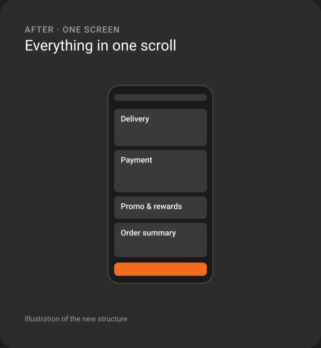
The new checkout puts every step on one scrolling screen. Customers can review and change anything without going back.
Starting checkout
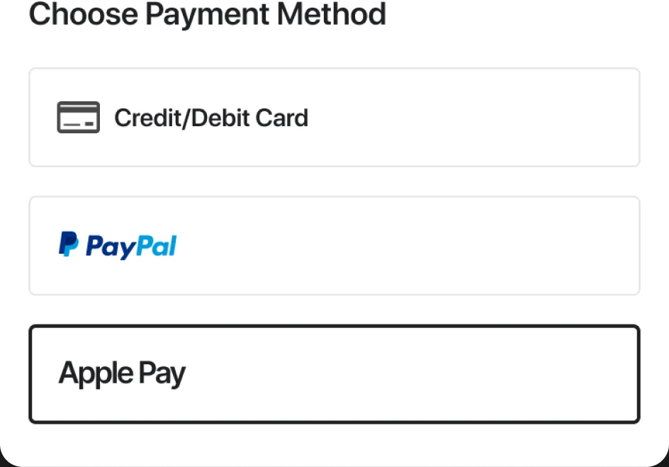
Pick how to pay before you start
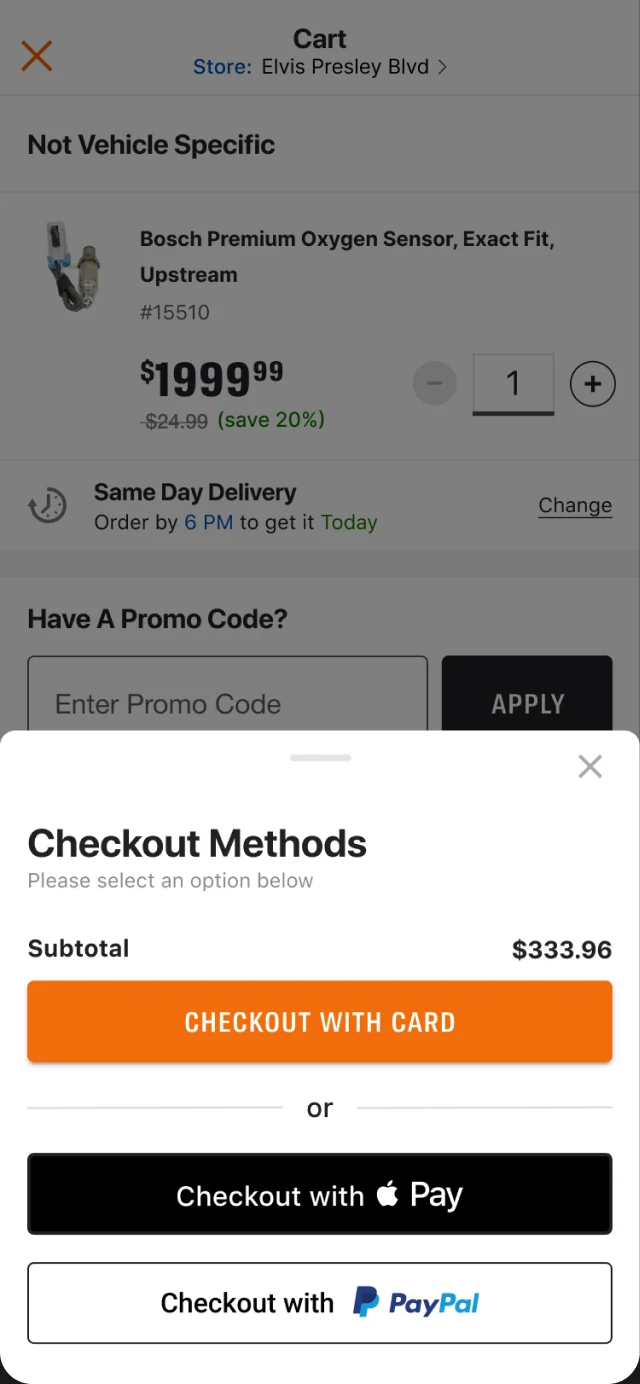
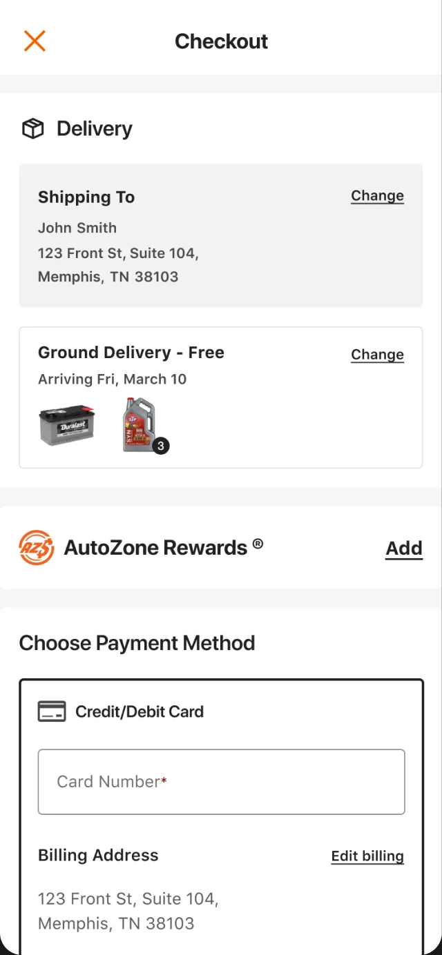
Checkout opens from the cart as a bottom sheet with every way to pay up front: card, Apple Pay, or PayPal. Choosing card goes straight to the one-screen checkout, with delivery at the top and the card form ready to fill.
One screen, every fulfillment
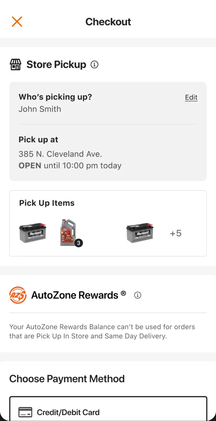
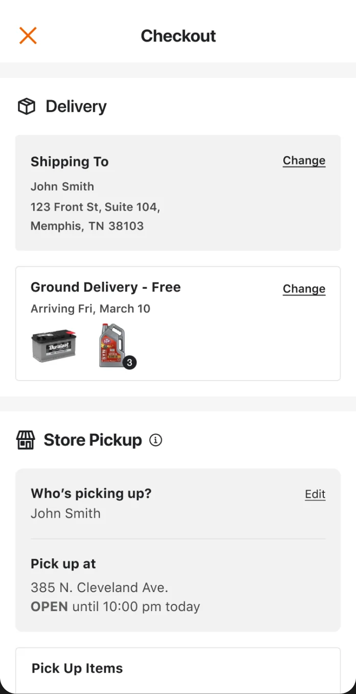
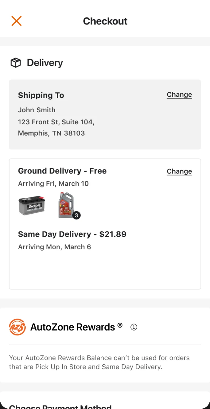
Ship it, pick it up, or both
The same screen adapts to how each order gets to the customer, so store pickup, split shipments, and faster delivery never send anyone down a separate flow.
Payment
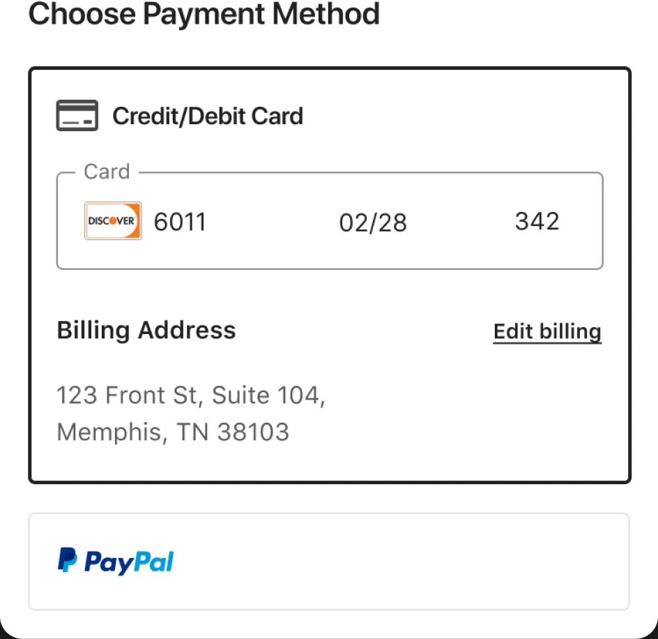
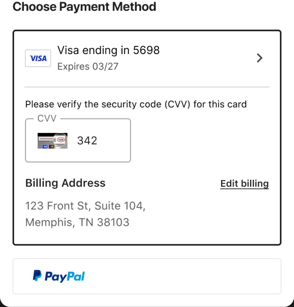
Fast for returning customers, simple for everyone else
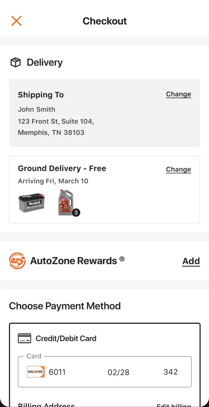
New card, saved card, or express pay all live in the same payment section. Saved cards only ask for the security code, and express options swap the purchase button for a one-tap native checkout.
Details on demand
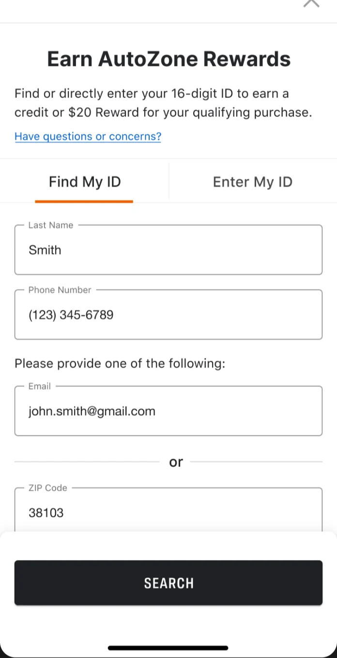
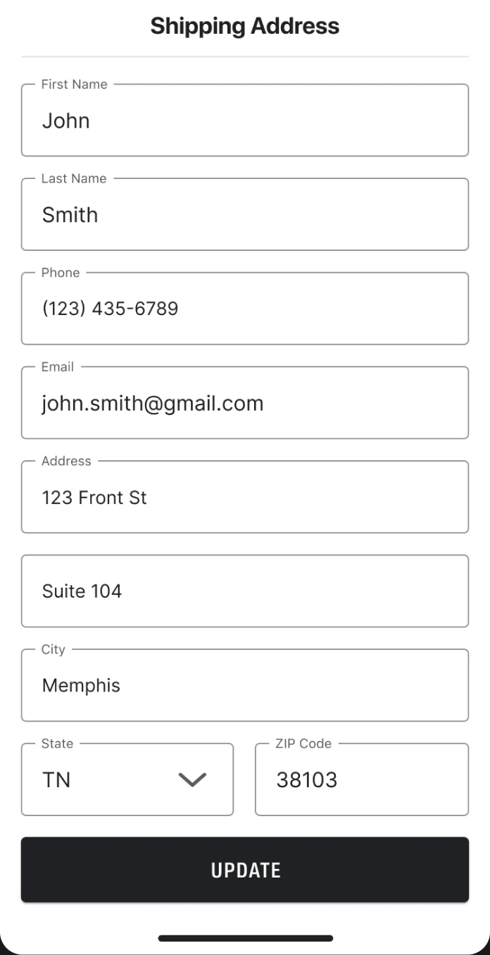
Edit anything without leaving the page
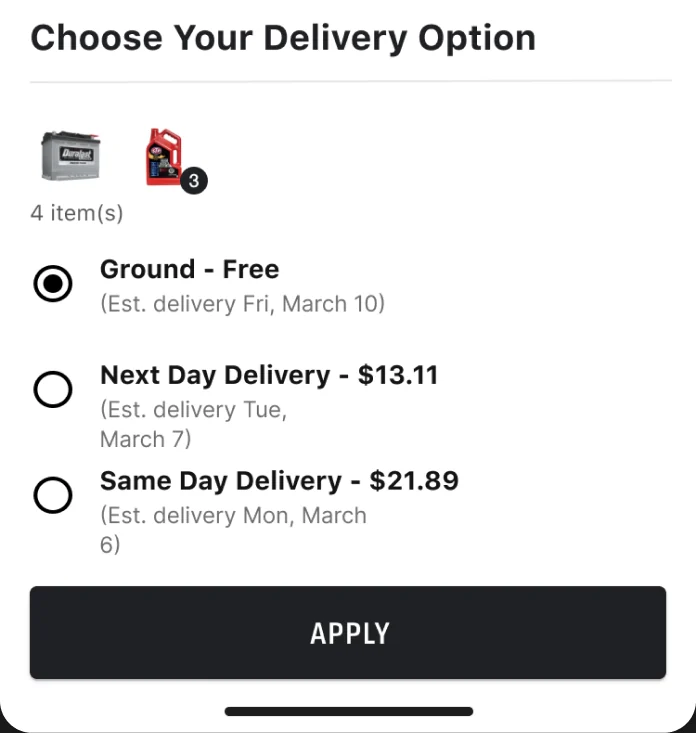
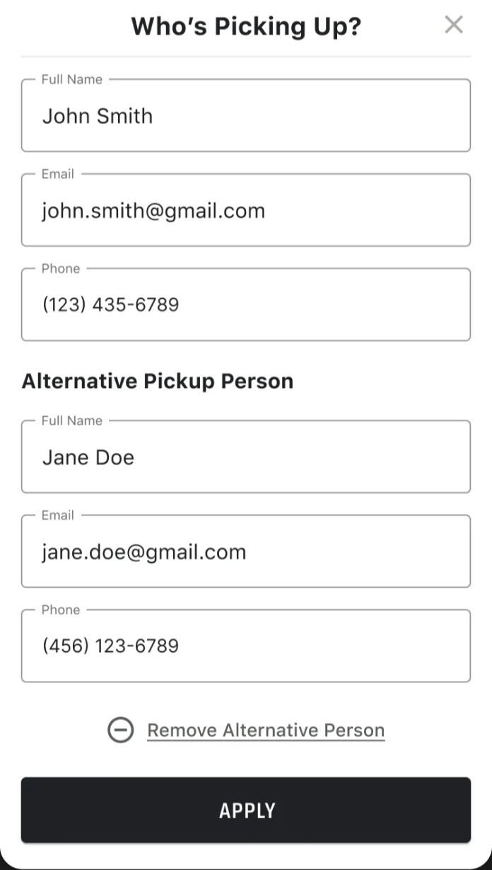
Every change opens as a bottom sheet over the checkout: rewards, gift cards, addresses, delivery speed, and who's picking up. Close the sheet and the customer is right where they were.
Built for native
Details that only a native rebuild allows
Because the app was rebuilt in SwiftUI, checkout could behave like a native app instead of a web page in a wrapper. I worked with our iOS engineers on custom components for the moments that mattered most.
A tab bar that becomes progress
The app's custom tab bar collapses into a progress state during checkout, so customers always know where they are without a separate step indicator.
Back means back
Swipe-back gestures were rebuilt to tell going back a screen apart from going back a step, so a swipe never throws away what a customer entered.
Sheets, not new pages
Rewards, addresses, delivery, and pickup details open as bottom sheets, keeping the order in view underneath.
Outcome
Shipped in the native app
Next case study
KeepStock Design System